A coffee roaster that needed to work in black and white
A full visual identity for a neighborhood coffee roaster, built to hold up on everything from cup sleeves to a delivery van — including the one constraint most brand projects never have to think about.
- Client
- Millbrook Roasting Co
- Role
- Design, print, packaging
- Timeline
- Five weeks
- Deliverables
- Logo suite, packaging system, van wrap, brand guidelines
The brief
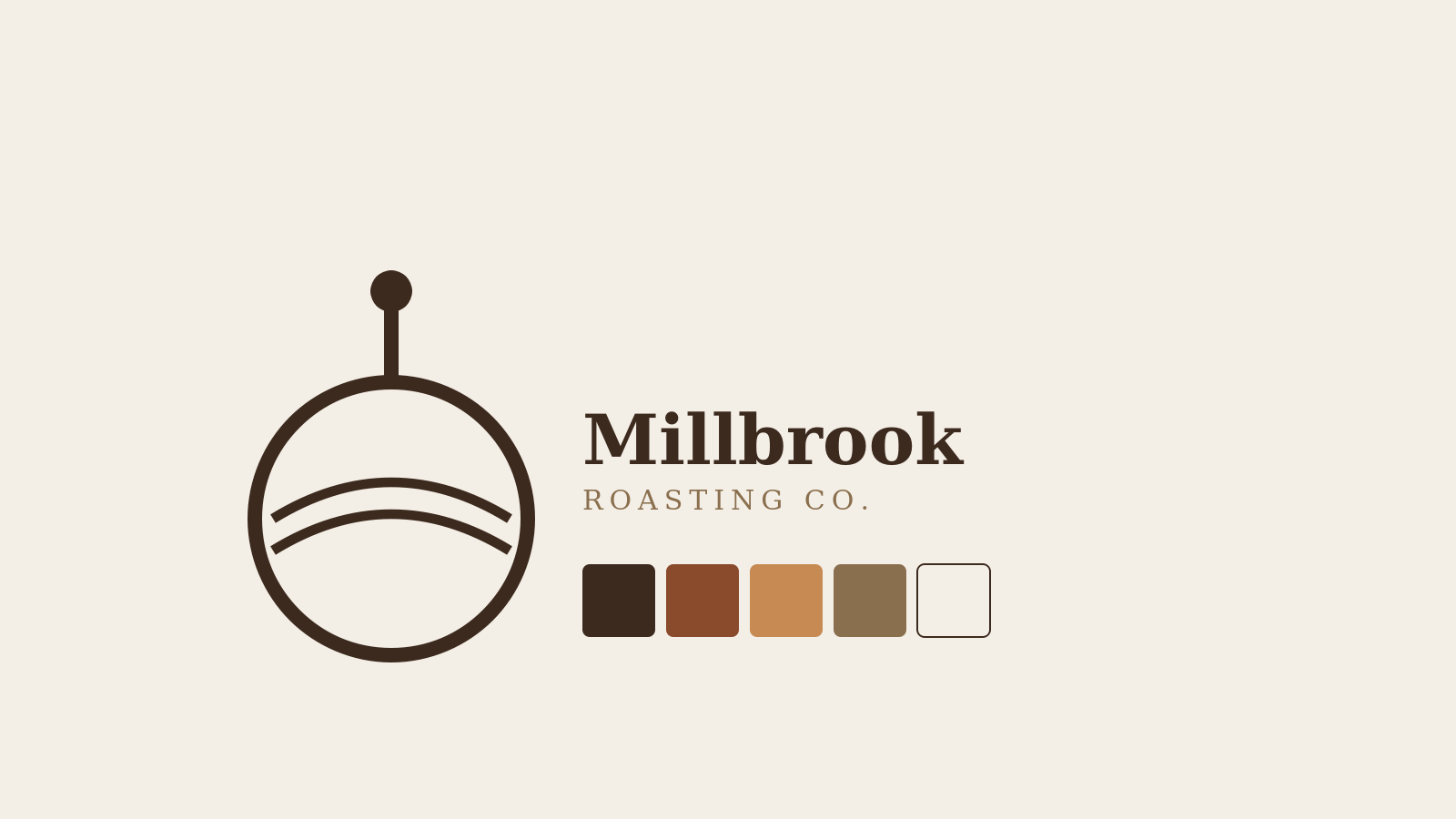
Millbrook had been running on a mark their founder sketched on a napkin in 2019. Regulars recognized it, but it didn't reproduce cleanly below business-card size. It also only existed as a single blue-on-white file.
Constraints
- The espresso machine's chrome badge (a fixed asset) had to stay visually compatible with whatever we designed
- No budget for custom packaging tooling — had to work with off-the-shelf bag and label sizes
- Needed to read clearly in pure black-and-white, since the local paper only prints in grayscale
The roasting-drum mark wasn't the problem. The fact that it only existed as one file, at one size, in one color, was.
What I did
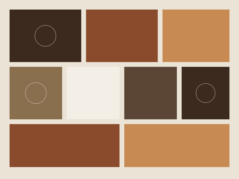
Palette first. Started from the existing warm brown and cream, but pulled a third color — a deep rust — from the roasting drum photography they'd been using on Instagram for years without realizing it was already their brand.
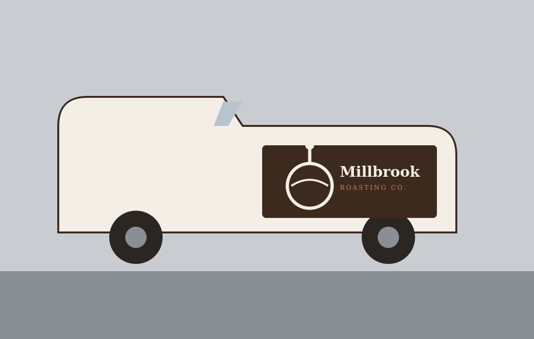
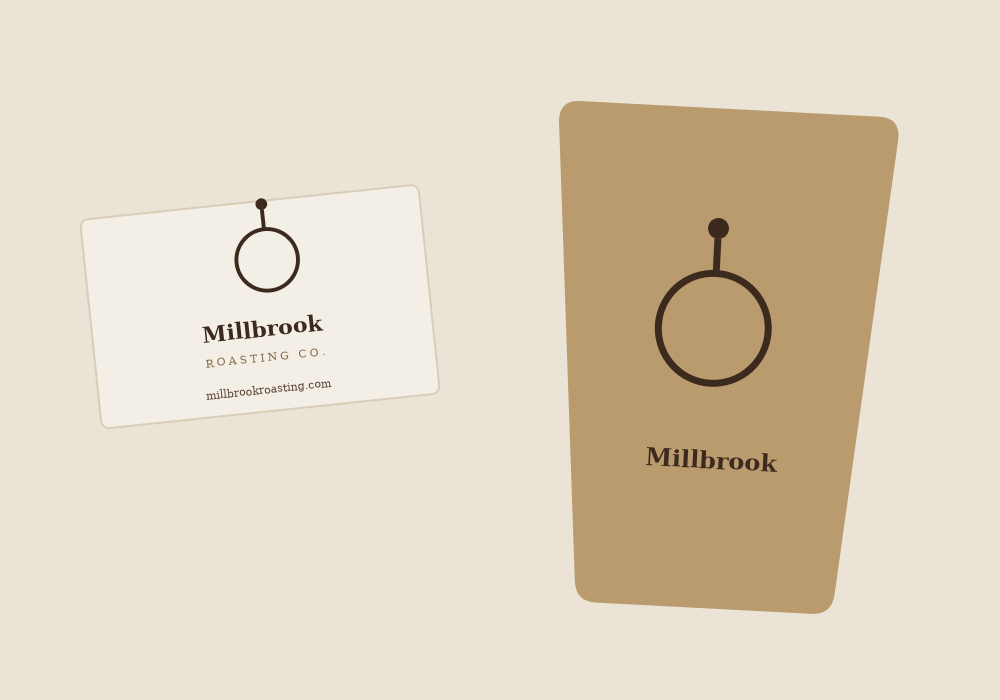
The mark. Rebuilt the roasting-drum illustration as clean vector linework instead of the original raster sketch, then built a full lockup system — a horizontal version for the van, a stacked version for the cup, and an icon-only version for the favicon and social avatar.
Type. Paired a rounded serif for the wordmark with a plain grotesk for everything else, so the brand feels warm without turning twee.
How it came together
-
01
Audit and palette Pulled every color already in use across their signage, packaging, and Instagram grid to find what was actually "Millbrook" versus what was just whatever the printer had in stock.
-
02
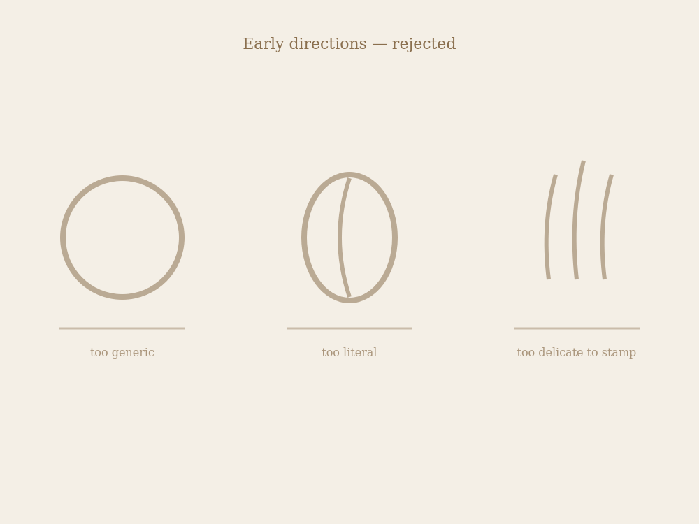
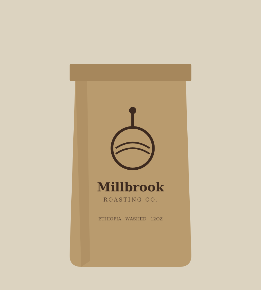
The mark rebuild Redrew the roasting drum three times before landing on a version simple enough to work as a single-color stamp on kraft paper bags.
-
03
Client sign-off, twice First round of packaging mockups came back with "needs to feel less corporate" — the fix was hand-lettered price tags on the packaging rather than printed type
The outcome
Millbrook rolled the new system out across packaging, the van, and in-store signage within six weeks of final files. The owner reported customers commenting on the van "for the first time ever" within the first month.
"I didn't think a napkin sketch could become an actual brand until I saw it on the side of the van." — Dana Reyes, Owner
Built with
- Illustrator
- Photoshop
- InDesign